Explorations with Interaction of Color
August 20, 2018

European 1: Visual memory is not very good. Humans discern color less effectively than audio and many know only about thirty colors. Design by Meredith Eliassen, 2018.
Minium, red sulphide of lead, was commonly used for small initials in illuminations and inspired the name for a genre of miniature painting: miniare –> miniature.
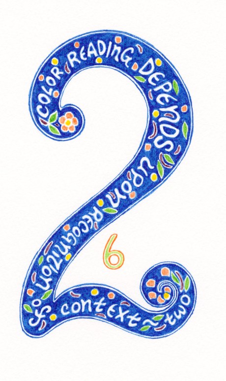
European 2: Reading color is contextual because we perceive color within spatial contexts. The interaction of color is seeing what happens between adjacent colors. Gestalt psychology asserts that human behave and perceive in unified patterns, the parts of which cannot be understood in isolation. Design by Meredith Eliassen, 2018.
Blue is often associated with mourning. During the Middle Ages, many gothic churches were colored with blue because it was thought to reflect the divine. For this reason, many portraits of the Virgin Mary have her donning robes of vibrant blue.
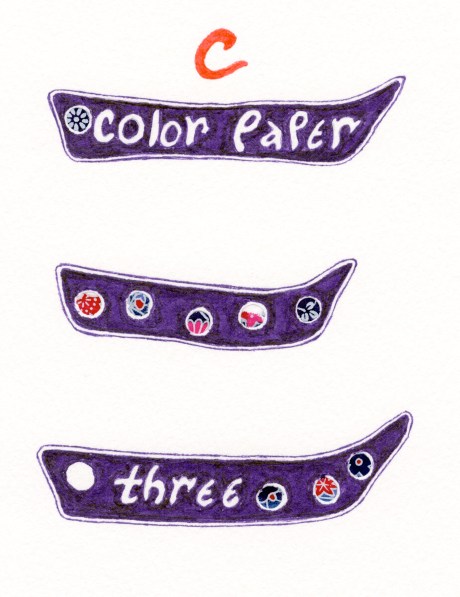
Chinese 3: Albers had students utilize color papers to do exercises so that they focused on the interaction of color rather than mixing colors. Design by Meredith Eliassen, 2018.
Purple, blending red and blue, for many cultures, signifies power, it is not very visible in the color spectrum even though violet reflects the very shortest spectral wavelength that humans can see.
