Explorations with Interaction of Color
August 20, 2018

European 1: Visual memory is not very good. Humans discern color less effectively than audio and many know only about thirty colors. Design by Meredith Eliassen, 2018.
Minium, red sulphide of lead, was commonly used for small initials in illuminations and inspired the name for a genre of miniature painting: miniare –> miniature.
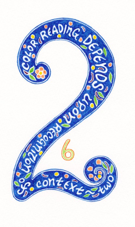
European 2: Reading color is contextual because we perceive color within spatial contexts. The interaction of color is seeing what happens between adjacent colors. Gestalt psychology asserts that human behave and perceive in unified patterns, the parts of which cannot be understood in isolation. Design by Meredith Eliassen, 2018.
Blue is often associated with mourning. During the Middle Ages, many gothic churches were colored with blue because it was thought to reflect the divine. For this reason, many portraits of the Virgin Mary have her donning robes of vibrant blue.
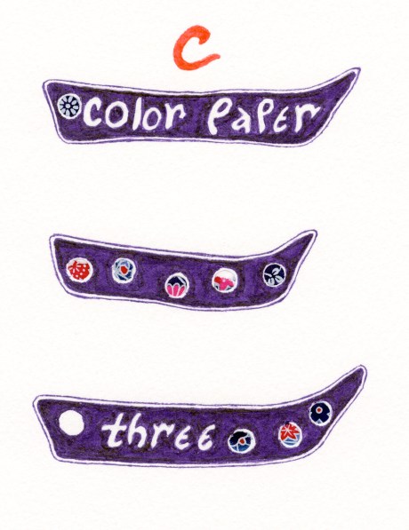
Chinese 3: Albers had students utilize color papers to do exercises so that they focused on the interaction of color rather than mixing colors. Design by Meredith Eliassen, 2018.
Purple, blending red and blue, for many cultures, signifies power, it is not very visible in the color spectrum even though violet reflects the very shortest spectral wavelength that humans can see.
The Many Faces of Color…
August 15, 2018
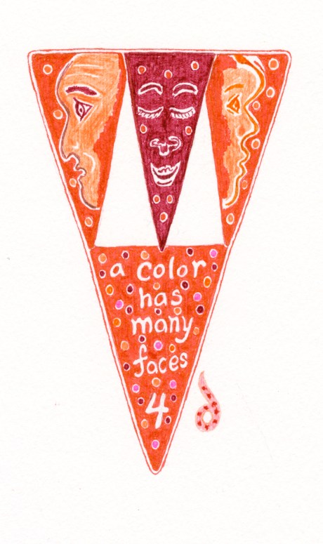
Babylonian 4: a color has many faces that are reflected in experiences that are relative in nature. Observations of color within different contexts creating deceptive optical illusions. Design by Meredith Eliassen, 2018.
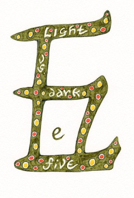
Chinese 5: Our eye’s ability to adjust its retina is a means to adjust to higher or lower light condition; when seeing gradual gradations between light and dark, humans are often unable to distinguish between subtly lighter or darker colors so that some shades of gray get lost. Design by Meredith Eliassen, 2018.
Deceiving color
August 14, 2018
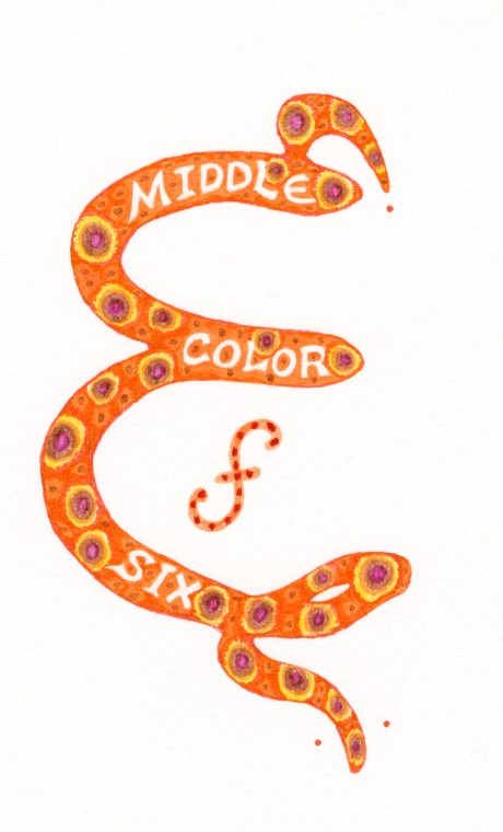
Hindu 6 illustrates the concept of middle color to show that color performs simultaneous functions. Design by Meredith Eliassen, 2018.
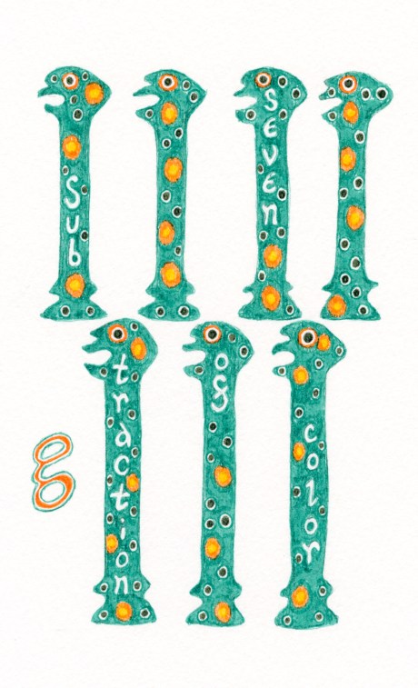
Ancient Egyptian 7 illustrates the concept of the subtraction of color to show that color can perform many roles. Design by Meredith Eliassen, 2018.
Ancient Roman 8 illustrates after-image color deception. The human retina receives three primary colors (red, yellow, or blue); by staring at the red, it becomes fatigued and sensitive to red sections so that a subsequent sudden shift of focus to white will cause the mine to perceive red’s complimentary color. Design by Meredith Eliassen, 2018.
To purchase other designs as cards from Zazzle.
Color’s illusions…
August 13, 2018
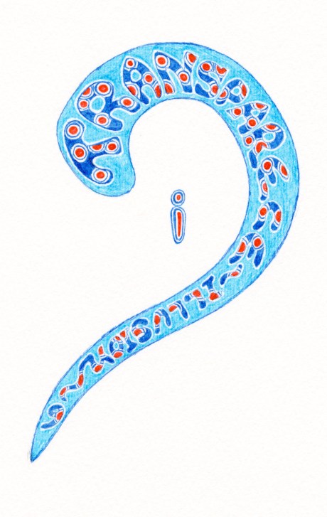
Ancient European 9, circa 12th century illustrates the illusion of transparence when color mixture leads to a loss of opacity so that it appears transparent or translucent. Design by Meredith Eliassen, 2018.
Greek 10 shows that transparent illusions occur as color gains light only in direct color.
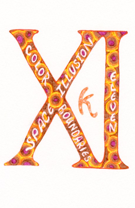
Roman 11 illustrates color boundaries and plastic action, a space-illusion employed by Paul Cézanne (1839-1906), design by Meredith Eliassen, 2018.
The Impressionists….
August 10, 2018
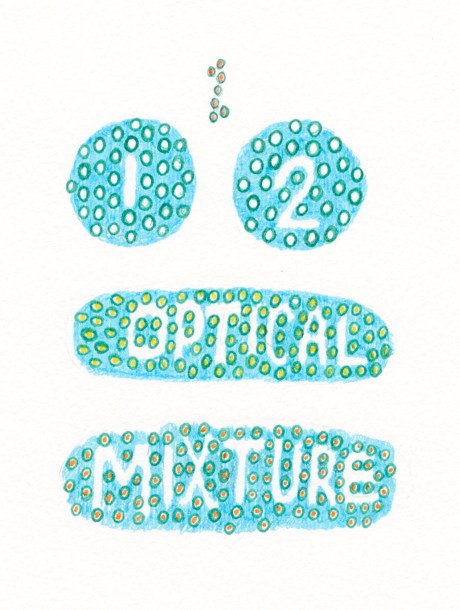
“Mayan 12” illustrates optical mixture where color dots change other colors by merging into a new color, which was used by Impressionists. Pointillism is a technique of painting in which small, distinct dots of color are applied in patterns to form an image. Georges Seurat (1859-1891) and Paul Signac (1863-1935) developed the technique in 1886, branching from Impressionism. Design by Meredith Eliassen, 2018.

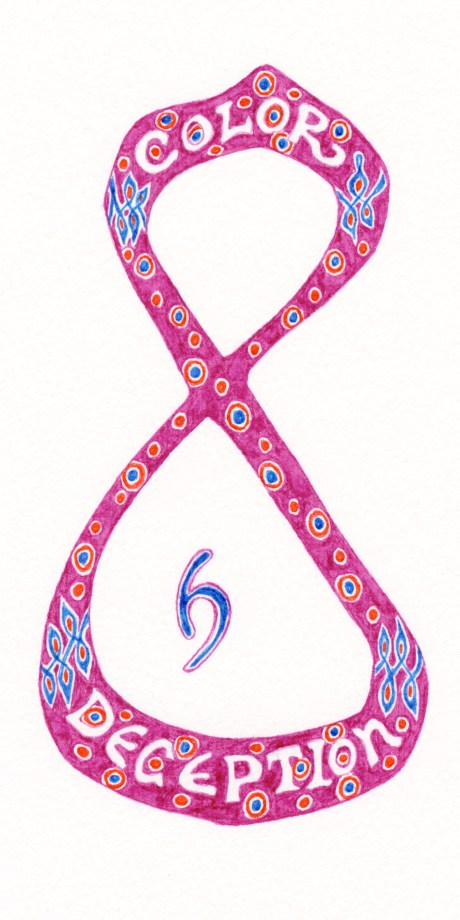
“Mayan 13” illustrates the Bezold Effect, another optical illusion, named after a German professor of meteorology, Wilhelm von Bezold (1837–1907), who discovered that a color may appear different depending on its relation to adjacent colors, which happens when small areas of color are interspersed. Design by Meredith Eliassen, 2018.
Thursday on the trail bead motif…
August 9, 2018
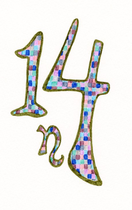
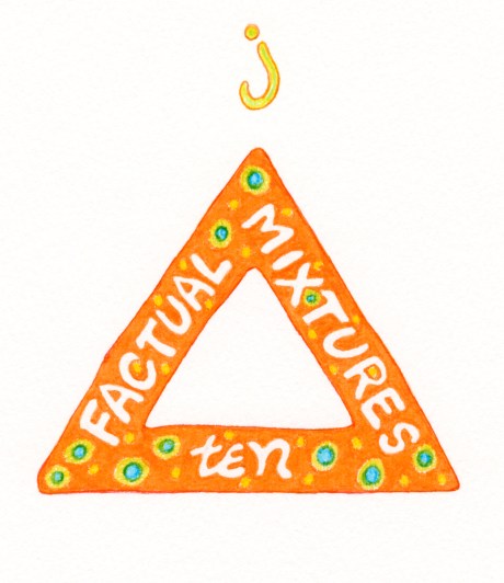
14 features tonal parallel intervals, design by Meredith Eliassen, 2018.
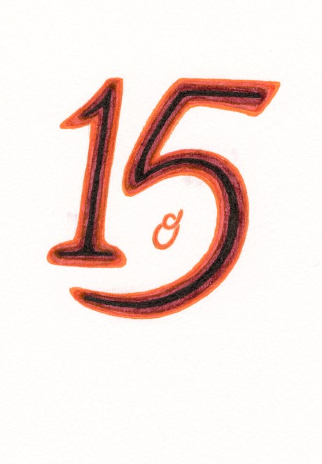
15 features experiment with intersecting color (middle mixture color) that would have been more successful using paper instead of ink; the result was too murky. According to Albers this exercise should illustrate a new deception the “fluting effect” found in a Doric column, which shows the illusion of volume. Fluting in architecture is the shallow grooves running vertically along a surface. The term typically refers to the grooves running on a column shaft or a pilaster, but need not necessarily be restricted to those two applications.

16 features trail bead motif, design by Meredith Eliassen, 2018.
Color play… trade wine bead motifs
August 8, 2018
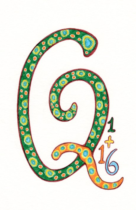
17 features letterform “Q” with eye bead motif, design by Meredith Eliassen, 2018.
Shakespeare’s ability to create linguistic imagery established a symbolic connection between the color of green and the emotion of envy, yet green is also the color of paradise… the garden… growth… and the emergence of spring:
Merchant of Venice (II,ii,108) “How all the other passions fleet to air, As doubtful thoughts, and rash-embraced despair, And shuddering fear, the green-ey’d jealousy.”
Iago in Othello (III,iii,165) “O! beware, my lord, of jealousy; It is the green-et’d monster which doth mock The meat feeds on; that cuckold lives in bliss Who, certain of his fate, loves not his wronger; But, O! what damned minute tells he o’er Who dotes, yet doubts; suspects, yet soundly loves.”
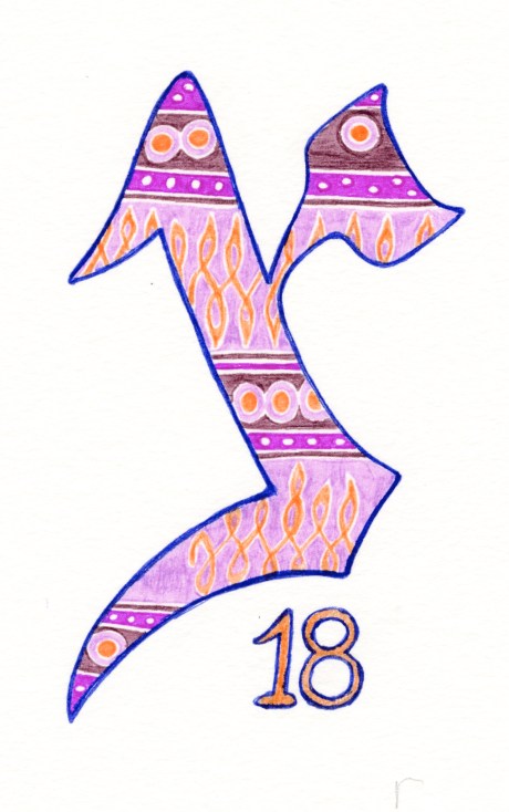
18 features Yerushalmi letterform of “tzadi” with trail bead motif, designed by Meredith Eliassen, 2018.

19 features Sephardi letterform of ‘kopf” with ancient eye bead designed by Meredith Eliassen, 2018.
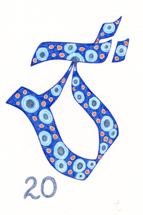
20 features Tibetan letterform of “tsa” with ancient eye bead motif designed by Meredith Eliassen, 2018.
More free studies…
August 7, 2018

21 features Greek letterform of “upsilon” designed by Meredith Eliassen, 2018.

22 features a light green base color, design by Meredith Eliassen, 2018.
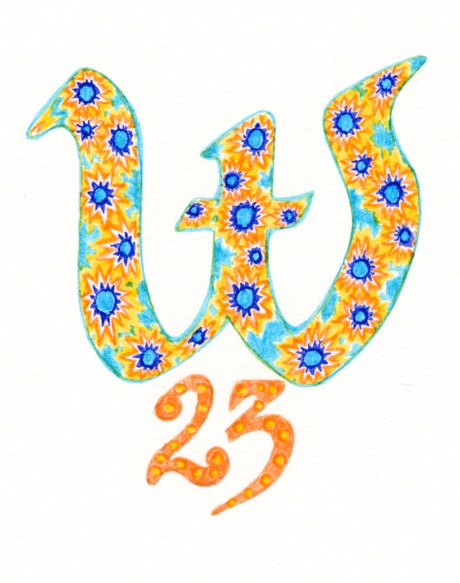
23 features a light blue base color, design by Meredith Eliassen, 2018.
Free studies… X Y Z
August 6, 2018
Mosaic millefiore glass bead motifs from the nineteenth century were made with ancient techniques developed in western Asia where composite case canes of preformed unites were fused together to create colorful complex designs.
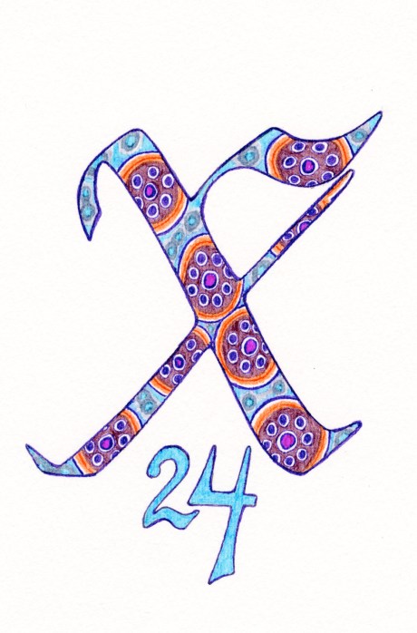
24 features a light blue base color, design by Meredith Eliassen, 2018.
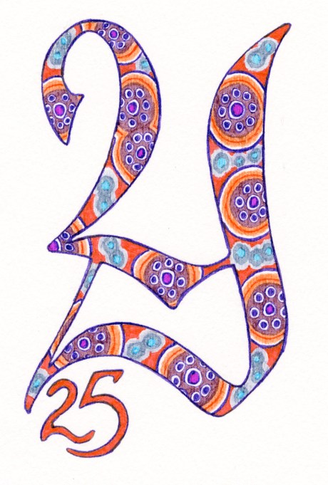
25 features a red base color, design by Meredith Eliassen, 2018.
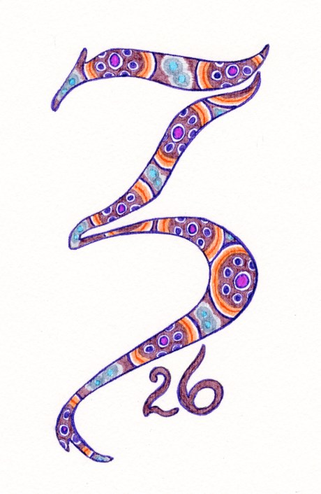
26 features a mauve base color, design by Meredith Eliassen, 2018.
Going in search of Albers…
July 23, 2018
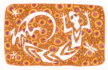
Lucky Spirit design by Meredith Eliassen, 2018. Notecard
This summer I have decided to take a break and play with color using Josef Albers Interaction with Color. Though I am not using colored papers, as he recommended, I am exploring his exercises, and in the coming weeks I will share some results.
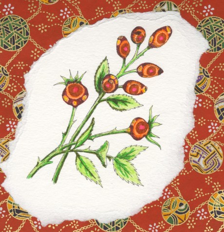
Rosehip design by Meredith Eliassen, 2018.
Even in comparing these to designs employing the same colors, the colors show that they have different interactions.
